Thursday, February 28, 2019
Richard Serra
Richard Serra has built many large steel sculptures. He specializes in site-specific installations, with the goal of making the person observing the sculpture seem like a dwarf. Charlie Brown is an interesting sculpture because of the name. The sculpture was simply named Charlie Brown because the morning that Serra had met with his client, it was the morning that Charles Schultz (the creator of Charlie Brown and the Peanuts) had died. Schultz was from the same area where the sculpture was being installed so everyone agreed Charlie Brown was a good name.
Richard Serra Open Ended
It is made of weatherproof steel. I chose this work because he said it was important to him for a person to be able to enter an experience and make people feel almost unsettled when doing so. I thought since this work included lots of narrow space instead of many of his more open works and that it had many turns it was the most appropriate fitting for him.
Richard Serra
Richard Serra is best known for his minimalist constructions from large rolls and sheets of metal. Many of these pieces are self- supporting and emphasize the weight and nature of the materials. Rolls of lead are designed to sag over time. His quake often encourages movement in and around his sculptures.
Richard Serra: The Hedgehog and the Fox
This sculpture is “The Hedgehog and the Fox” made in 2000 by
Richard Serra. I like how all these massive sculptures give the visitors the
ability to walk through the sculpture and appreciate it. This sculpture is located
on Princeton University. The sculpture is 15 feet high and 94 feet long. When
researching this piece of art I found out the name comes from a quote from the
Greek poet Archilochus, “The fox knows many things but the hedgehog knows one
great thing.” I like how the sculpture represents this quote with 2 different
way to walk through one as the hedgehogs and one as the foxes. Hedgehogs are
known to follow one principle while foxes have a different approach. I also
liked that the steel sheets are reddish-brown rust which suggests the color of
a fox.
7: Richard Serra
Richard Serra created his 80 foot sculpture "7" making it the tallest sculpture in his collection. It is constructed by seven steel plates and made to represent the scientific and spiritual aspects of the number seven in Islamic culture. It is expected that the color will change from orange to a dark uniformed shade due to oxidization. When walking into the sculpture, as you look up you are greeted by the sky and a symbolic heptagonal shape. It is a beautifully well crafted piece.
Richard Serra
Richard Serra sometimes works with or learns from contemporary musicians, dancers, and videographers. Serra's House of Cards was made in 1969 out of lead antimony. He first came across thus material when he was younger while working at steel mills and shipyards. This sculpture is formed by one edge of each side leaning against each other. When he first made it, he said it seemed like it was going to collapse. In the early 1960s, he made a sculpture called "verb List." This sculpture is reacting to the verb "to prop."
Richard Serra: House of Cards
Richard Serra lives and works in New York's Long Island. He is known for his abstract artwork and use of towering steel beams. This sculpture was crafted in 1968-1969. It uses 4 steel square plates each measuring 55 (almost 5 feet tall). This is a smaller scale sculpture of his, as some of his artworks tower over 50 ft. I particularly liked this because of the colors used and the simplicity of this piece. The silvery blue hues along each of these 4 sides reminds me of the moon and the dark sky.
Richard Serra
Richard Serra is an American artist who is known for his large steel sculptures. His work is very interactive as you can walk through them, touch them, and really get a different perceptive of them from different angles. This piece by Serra is titled "Between the Torus and the Sphere" and was done in the early 2000s. I chose this one because from this angle it looks like dominoes where the first one is leaning towards the others and looks like it is going to knock them down. But as you walk through this piece, you can get different interpretations of it from all the different angles to which you can see. It consists of 8 pieces of steel curving different ways to really make it a different experience down each isle.
Richard Serra - Forty Years
Richard Serra is an American sculptor that creates unconventional pieces with industrial materials that push the limits of abstract art. The sculpture above, titled Forty Years, was made in September of 2007, which is approximately 40 years into Serra's career as a sculptor. It portrays Serra's unique style of large-scale architectural work. Originally when one thinks of steel sculptures, it is easy to picture a stiff, strong looking piece of art. Serra pushes the boundaries of this traditional thought of steel sculpture by stretching and bending it to make it look almost fluid-like. As far as the overall meaning of the piece, I interpreted it as the winding journey of life that takes numerous twists and turns but is beautiful nonetheless.
Richar Serra
I chose "balanced" because the power it seems to portray. It's a large piece of steel that is balancing on the two edges of each end. It perfectly balances the weight of the sculpture, which seems impossible.This creates an interesting illusion, because each direction it can look so different. I like the simplicity and how contemporary it is. He chose warm colors that blend throughout the piece, which seem to resemble earthy colors.
Richard Serra
Richard Serra is an American artist and sculptor that built this sculpture named "7". 7 is an 80 foot high sculpture that is located in the Museum of Islamic Art Park in Doha, Qatar. This sculpture is currently the tallest public art piece in Qatar and is also one of Serra's first sculptures shown in the Middle East. To build this sculpture, Serra had to design it based on the surroundings. I like how this manmade sculpture is in a shade of a heptagon. In addition, the piece of artwork represents the scientific and spiritual importance of the number 7 in the Islamic culture.
Richard Serra- Fulcrum
Richard Serra made this piece called the Fulcrum in 1987. This piece is located in London in front of one of the busiest business buildings.. The sculpture is 55ft tall, made out of metal. I like this piece because it's different than his other work. His other work tends to be more lengthy, this piece's biggest asset is it's height. I like how it's just 4 slabs of metal balancing on each other. No matter what way you look at the piece, it looks like the metal is moving and is delegate. Metal is hard, and just seeing it bent in such a fragile way balancing so lightly on each other is remarkable. Some say the reason why this is in front of the busiest building filled with bankers because this represents the banking system. One mistake can make the whole system/sculpture fall down. I love the fact that it is in front of the busiest buildings because when people are stressed from work or whatever, this gives them a few minutes of relaxation being able to analyze something so fragile can help relax you.
Richard Serra
Richard Serra was a American artist involved in the process art movement. In college he studied English literature at Berkeley and University of California, Santa Barbara. While at Santa Barbara he started studying art and then went on to study painting in the MFA program at Yale. This is a sculpture by Richard Serra called "Elevational Mass" which was made in 2006. I chose this one because it's different from the other I saw which looked like large pieces of bent steel and also because it looks like books.
Wednesday, February 27, 2019
Richard Serra
This is a Sculpture made by Richard Serra in 1981. It is found in Manhattan from 1981-1989. The name of this Sculpture is the Tilted Arc which was a controversial public art installation by Richard Serra. The art was considered of a 120- foot long, and being 12 foot high solid. The unfinished plate of rust which is covered is cor-ten steel. I have picked this sculpture by Richard Serra because it caught my eye with how unique it is by just looking at a wall but if you really look at it, it is beautiful art that can be seen by many angels.
Serra intersection
Richard Serra created intersection II between 1992-1993. This sculpture was meant to manipulate space and perception. Serra wanted people to feel and think about space from different angles as they walked through the three different pathways .
There’s four long tons of steel but three different paths. This is meant evoke a certain feeling when someone walks through.
Richard Serra
Richard Serra is a minimalist sculptor, who works with large scale metal in order to form art. His sculptures provide architectural and landscape settings with beautiful pieces, from New Zealand to Iceland. His sculptures offer an illusion for the viewers. They can walk through them like a maze, and see them up close to understand the detail. The piece above weighs 300 tons and is 125 feet long. It is known as "Wake", and is installed in Olympic Sculpture Park in Seattle.
Richard Serra
I chose Gutter Corner Splash: Late Shift (1969/1995) due to the contrast it has compared to his other works that appear more wall like and stand tall. This piece however lies on the ground and has a splashing effect on to the wall. Serra claimed "I was interested in my ability to move in relation to material and have that material move me." He appreciated the laws of gravity and wanted it to show through his work. He also incorporated old tactics of sculpture and present day methods. This one just stood out to me more because it wasn't like most of the others.
Tuesday, February 26, 2019
Richard Serra
This artwork is called 7 and it is 80 feet high. This sculpture is located in Qatar and it is the tallest piece of artwork Serra has ever made. This is also his first sculpture being presented in the Middle East. It was made in December 2011 and it is resting on a man-made plaza which is 250 feet into the harbor. This sculpture is in a hexagonal shape and he built this sculpture due to his friend I.M. Pei recommending Serra to build it. Pei wanted this piece of artwork in his museum. This sculpture was actually supposed to be 8 sided and around 66 feet. What is truly incredible about this piece is that individuals are allowed to walk through it and look up at the sky above.
Richard Serra
This sculpture is created by Richard Serra. This was installed in 1987 in London. Serra was an American artist that lives in New York. An interesting fact is that some of his work is actually in the Dia Beacon, across the Hudson river. This sculpture known as the Fulcrum was made out of weathering steel. I chose this sculpture and picture because of it's size. It is huge compared the the lady in standing next to it. I also enjoy the color of the steel and how it is rusting a bit. Serra's wok allowed you to walk around it, inside it, so you could get the full experience of the sculpture. I could not even think of how he was able to place these massive sheets of steel around each other.
David Smith
David Smith was an American abstract expressionist sculptor and painter, best known for creating large steel abstract geometric sculptures. David Smith completed this sculpture in 1963. It is made out of stainless steal and located in Jerusalem. It is part of an entire series of stainless steal sculptures. The entire series is called the Cubi Series and can be found in places like New York, London, and Chicago.
Louise Bourgeois
Louise Joséphine Bourgeois was a French-American artist. Although she is best known for her large-scale sculpture and installation art, Bourgeois was also a prolific painter and printmaker. The sculpture is called, The Nest and shows spiders of various sizes. Spiders were a common inspiration for much of Bourgeois' work. She didn't view spiders as evil creatures as many do. She viewed spiders as strong and protective. She has related them to her mother multiple times
Li Hongbo
Li Hongbo's works are characterized by their unique media- paper and glue. Initially inspired by the idea of tradition and ubiquity that paper embodies, Li creates a hidden element of surprise in his paper sculptures that stretch in infinitely many ways. I chose this work called, Bust of David because I like how real the face and neck look. Every part of it looks realistic.
Joan Miro
Joan Miro was a spanish painter, sculptor and born in Barcelona.
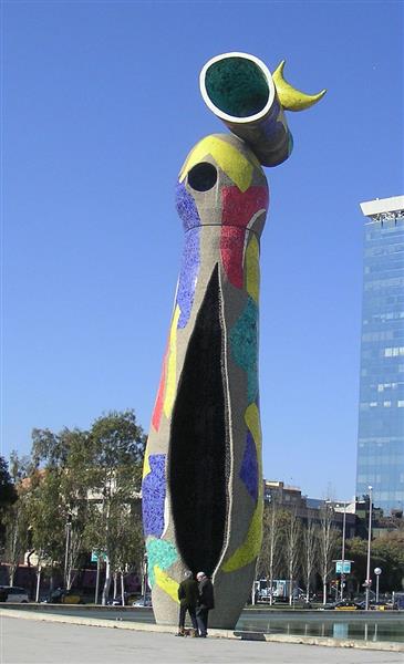
This monumental sculpture, standing 66 feet tall, was part of Barcelona's public art initiative and is considered Miró's last great work called, Woman and Bird. Assisted by a team of craftsmen, Woman and Bird was built of concrete and colorful, broken ceramic tile; its irregular contours and tile mosaic were in part an homage to the great architect Antonio Gaudi, whom Miró admired.
Thursday, February 21, 2019
Joan Miro Zephyr Bird
Painting done in 1956. I found it interesting because it is many unique shapes making an image. The choice of color makes it look appealing to the eye. The art is not realistic but you can depict a person and a bird in it even though things like the arms of the person are just crescents.
Joan Miro
Joan Miro was a spanish painter, sculptor, and ceramicist born in Barcelona. His work has been interpreted as surrealism. Some might say his work is very childish and a recreation of the subconscious mind. I chose to compare these two because I feel as though they both have the same color scheme and both have a distorted face and body. I also believe if you turn the sculpture sideways the face would look extremely similar to the painting.
Joan Miro
Joan Miro's "Woman and Bird" was on display in Parc de Joan Miro from 1982 to 1983. The purpose of his sculptures is to bring life and color to them. This sculpture is on display when you walk into the plaza in order to capture visitor's eyes. Joan Miro was born in Barcelona and is famous for using his imagination and transforming it into art. This sculpture was also based on dream- like themes, where on-lookers must use their imagination to understand what they are really looking at.
Joan Miro
Joan Miro was a Spanish painter, sculptor, and ceramist born in Barcelona. The sculpture is called "Jeune femme" which means young woman, was made in 1966 in the medium bronze. The painting is called "Femme, Oiseau, Etoile" which means woman, bird and star. This painting was done in 1942. I picked these two pieces of art because they caught my eye. I think they look similar when looking at the woman. The arms and the head were made in the same shape. The arms looking the same is really what drew me to putting these pieces together.
Joan Miro
Woman in front of the sun. It is said that this painting is indicative of a "monster's" head and arms. A large black figure arises against the dark blue starry surface. This makes me think that this being is "seeing the sun", coming to terms with the light and bringing itself out of the dark
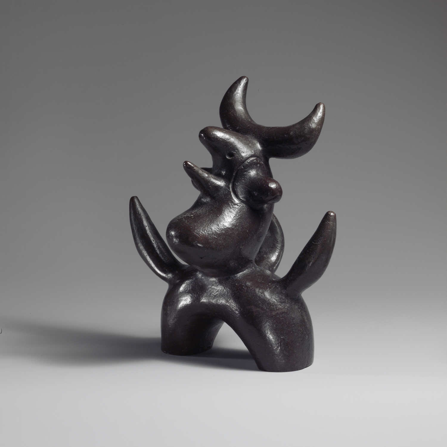
Moon bird. Looks like a bird sitting on the moon. Crescent shapes in the sculpture to me represent the moon. Both of these incorporate astrology in opposite ways (the light of the sun and the darkness of the moon)
The Cock and the Rooster: Joan Miró
Joan Miro's 1940 The cock was created using gouache, watercolor, and pencil on paper. Miro had a powerful and direct relationship with nature as he stayed on his family's farm at the age of 18 (Catalan countryside). He embraced the flow of nature and identified with how one would with peasants and farmers; once stating he is "much happier with farmers" as opposed to being "among dutchesses in great palaces." Still taking the same idea he, in turn, created The Rooster in 1970 out of bonze. Joan Miro always carried his roots in his work as he evolved. It goes to show who he is at a deeper level and how that comes through in his art.
Joan Miro
Joan Miro
Joan Miro was a Spanish painter, ceramist, and sculptor who's work was mostly based on Surrealism. The painting of his that I chose was a "Figure at Night Guided by the Phosphorescent Tracks of Snails" done in 1940. It is a surrealist abstract painting consists of overlapping figures, abstract shapes, and only 3-4 colors. It was part of his "Constellations" series from 1939-41. It has a dreamlike quality to it even though it is abstract. The sculpture of his is called "Double-sided monolith" which is made of stoneware and enamel. This sculpture was done in 1956 but has very similar qualities to this painting of his, as it also has a dreamlike quality to it even though it is abstract.
Joan miro
Tilled field 1923-1924
Harlequins carnival 1924-1925
These were the first two surrealist paintings done by Joan Miro.
Though they were his real first paintings both depicted his way of life, experiences, ideas and culture. Joan's Spanish culture was very much prevalent his paintings especially in the harlequin carnivals. This showcases celebration that took place before lent. While there were happy times depicted so were his trials. I found both these paintings similar but tells different sides of Joan miro.
Women and Bird
I chose the sculpture because I was interested into what it represented. I was attracted to the colors and the height of the sculpture, and that it was an interesting name. It turns out that Miro sculpted women to represent the universe and the bird to represent the earth. So beneath all of the colors and dimensions, he wanted to sculpte this to represent a link between the earth and the universe. Looking at his painting, the women is painted with more female characteristics, and it is easier to distinguish the bird and the women.
Joan Miro
The painting by Joan Miro is called "Dona Amp Capell Bonic Estel." In English, this means Woman With Hat Beautiful Kite. Miro painted this picture in 1978.The sculpture that replicates this painting is "Taking Miro for a Spin" by Mindy and Paul Rodman White. Both the sculpture and painting are very intriguing. I like how they both look similar to each other in which they use the same colors and similar shaping of the objects.
Joan Miro
Joan Miro was a Spanish artist that masterfully created surreal pieces that seemed to channel his inner imagination. Similar to the painting above, most of Miro's pieces reflect elements of surrealism that are childlike and playful; they feature bright colors and appear to be similar to a child's sketchbook. I chose these two pieces because of their playful aura. In the sculpture titled Personnage, conceived in 1970, Miro created a whimsical monster character that has a long oval head with two big eyes. I thought that his painting titled Tbe Sun Eater, done in 1955, featured the same aspects of his sculpture and maybe even inspired him to bring this painting into the world of three dimensional art.
Wednesday, February 20, 2019
Joan Miro
The painting is of, “Man and Woman in Front of a Pile of
Excrement” by Joan Miro. This painting illustrated the tragedy and torture of
the Spanish Civil War. This painting was created in the time of rioting in
Spain after the War. This paintings supposed to relate to the period of unease
that Spain was going through. I liked the use of the bright colors and the
abstract ideas involved. I felt that the sculpture “Jeune fille S’evadant”
looked similar to the painting. Both used and incorporated the bright complementary
colors. I also see similarities in that the sculpture is abstract and the
person has no arms but humanistic legs. I read that the exhibition this
sculpture is from is when he felt attracted to the objects with magnetic force,
and added an object to another object like our found object sculptures. I just
liked how different this sculpture was and how original it became as he was
able to create something so different.
Joan Miro
John Miro used collage and building objects as a mean to rebel against the norms of art. These particular works are named "Head in The Night". I was intrigued by these because the similarity isn't as obvious as the other ones I looked at. The painting and the sculpture are different in many ways such as color and shape. The painting expresses much more color and doesn't hold the exact same shape as the sculpture but still takes on a form that makes it seem familiar. The space Miro uses in both the sculpture and painting is fascinating, leaving room for the viewer to think or see more than what is there. Miro also used some techniques on the sculpture to evoke sleep and appear as if paint was used.
Subscribe to:
Posts (Atom)